Austin Home Tour
DIY couple builds one-of-a-kind Austin home on a budget
When Shane Pavonetti tells people he spent $165,000 on his new modern farmhouse in an up-and-coming neighborhood of Austin, he quickly has to explain that the situation isn’t normal. That’s because he was the architect, general contractor, and steel fabricator all in one. And his wife, Holly, a wildlife preservationist, took on most of the interior design duties.
“We didn’t pay a contractor or architect or designer,” Shane says. “If you want to do that and take a year out of your life, you can do it for the same price. Sure, you’ll save 50 percent, but it will take two-and-a-half times as long.”
Money-saving aside, there were other benefits. Shane and Holly were able to fine-tune every aspect of the home. For example, they made plans for a future master suite expansion by drawing the suite on the schematics. “But then, where the door would go into that, we just built a wall,” Shane says. “In the future we’ll frame up the addition, and all we have to do is cut a hole in the Sheetrock and install a door without interrupting the rest of the house.”
The Pavonettis lived onsite during construction by plunking a few thousand dollars into an existing 300-square-foot cottage out back to make it livable. This gave them a huge advantage, because it meant that Shane could keep an eye on the progress every day and make sure all the exposed framing, flooring, and ductwork they specified didn’t get mucked with.
“Being on a very low budget per square foot, I was there like a hawk on everything,” he says. “I had to make sure no one got glue on anything that would be exposed. People think they can be sloppy if they’re not going to see it. Concrete guys are typically thinking there will be carpet put in over it, so they don’t care about getting purple PVC primer all over the floor.”
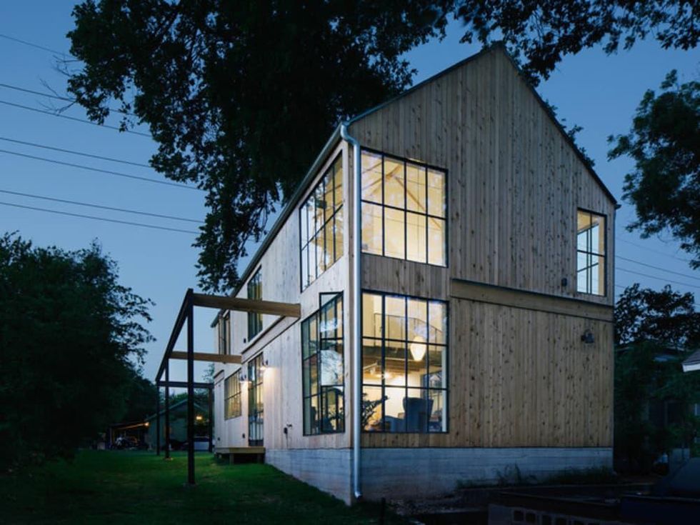
He chose cedar siding because of its abundance in Texas, its connection to historical farmhouses in the area, and its weather-resistant properties. “It was a big choice and a big expense for us, but it was important for me that the house stand out and look different but also feel familiar and of the vernacular of old Texas homes and barns in the area,” he says.
He ran the siding vertical to make the house seem taller and skinnier than it really is. “If everything was oriented horizontally, it would give it a more hunkered-down look,” he says.
The form of the house, he says, is rather traditional in many parts of the world, but the lack of trim, lack of overhang and exaggerated skinny windows bring it back to a modern home. The steel framing is for a future wraparound patio that isn’t funded yet, Shane says.
My Houzz: Modern Industrial Style for a DIY Update in Austin
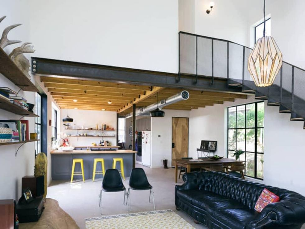
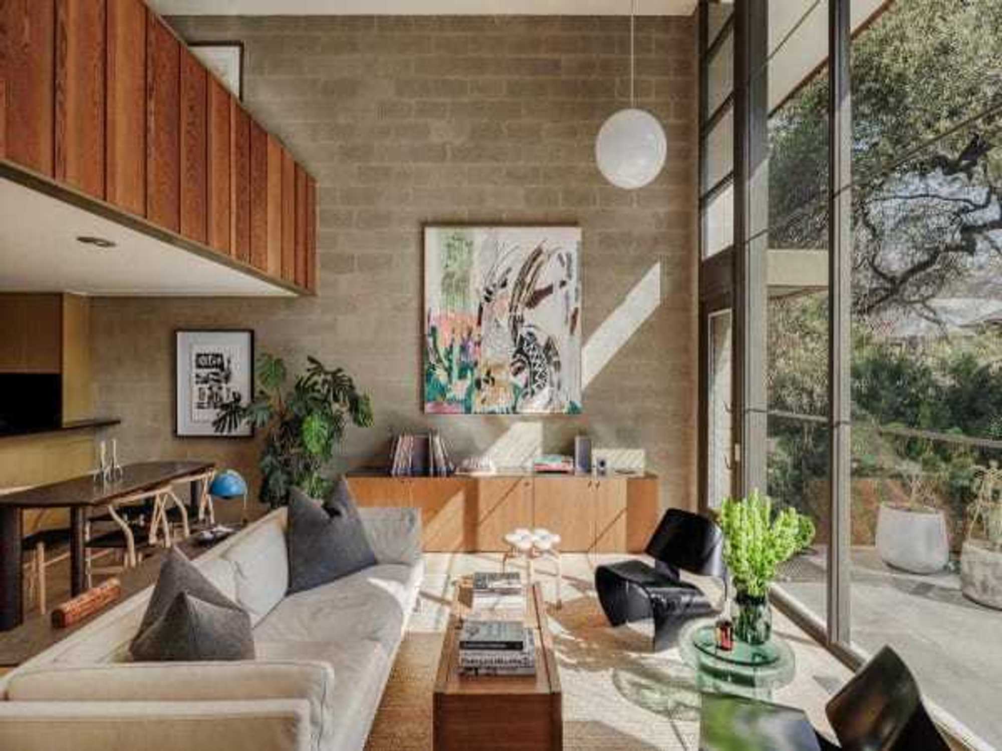
Inside, the Pavonettis wanted to focus on larger public spaces while keeping the bedrooms small. The scale of the public spaces, like the double-height living room, was planned with the future expansion in mind. “We don’t spend time in our bedroom except for sleeping and storing our clothes; we find downstairs more enjoyable,” Shane says.
A corner with 18-foot-high windows brings in views of surrounding heritage pecan and elm trees. Shane wanted a very specific window style, but since he couldn’t afford to have them professionally manufactured, he designed them himself, then had the frames welded, powder coated, installed, and he had his father help him place every panel of glass.
“There were 130 of them in the house,” Shane says. “It was a big undertaking. It’s easier to make every decision yourself, but the sacrifices we made … I wouldn’t suggest building custom windows by scratch, because it takes a lot of time.”
Holly played a big role in the decor of the home. She found a chesterfield sofa on Craigslist, and Shane says he just had to have it. “It’s by far the most expensive thing in the house,” he says.
The wooden doors are temple doors from China that Holly’s mother had bought a decade ago. A stereo sits on a big slab of monkey pod wood that her grandfather brought back from the Philippines during his time in World War II as a supply officer on a ship. Holly and Shane bought a chandelier for $85 in Mexico; the moose antlers they picked up in Michigan; and the blue chair and rug are from Ikea.
The side table was once a commercial bucket for lard. “Don’t worry; it’s clean on the inside now,” Shane says.
He built the shelves from reclaimed wood left over from the house they tore down and slender shelf supports from Anthropologie.
Exposing the framing and ductwork was a must for Shane. “I’m interested in the reality of materials and the reality of what gets built,” he says. “I like to be as close to the original materials as possible, and it’s interesting to me to be close to what the house is made of. The exposed ceiling — this is what the house is made of, and I think it’s beautiful and I want to see it.”
Granted, this approach takes more effort than it looks. Pavonetti had to make sure the plumbers didn’t run plumbing across the ceiling thinking it would get covered up later. “If you tore the ceiling out of a normal house, for example, it wouldn’t look like this,” he says.
Add an Industrial Edge With Exposed Ceilings
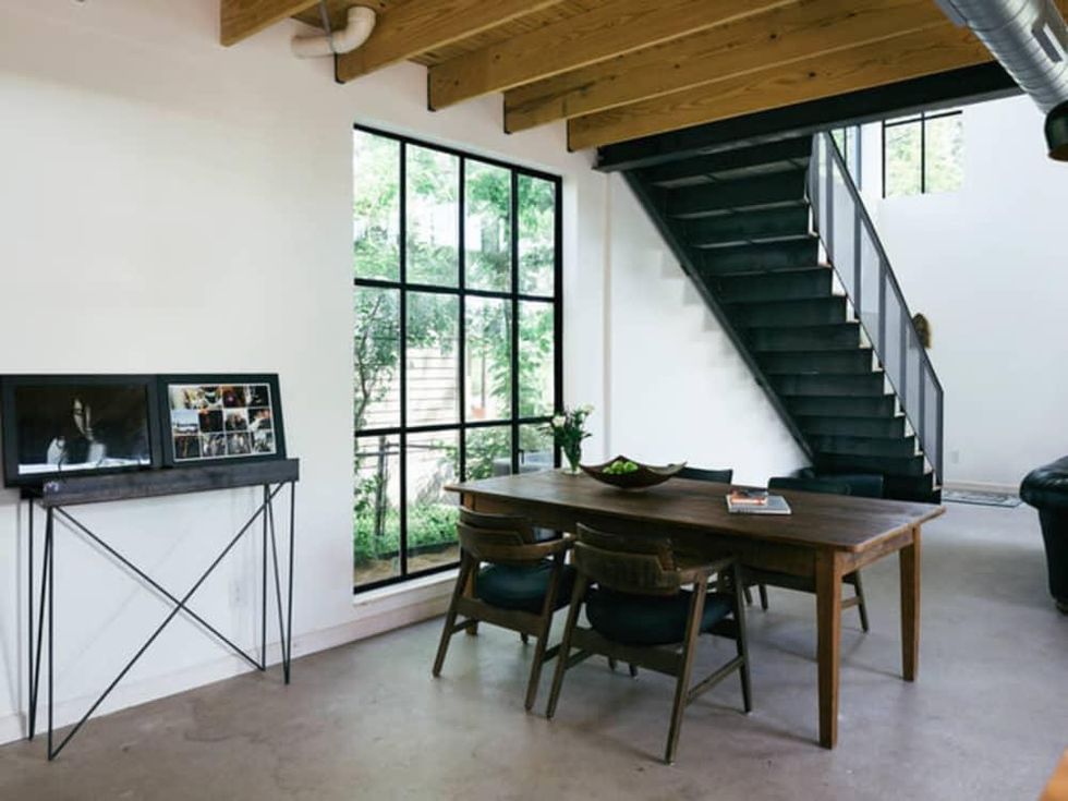
Shane welded and fabricated the steel stairway from a big pile of steel. “I budgeted five days, and it took me over three weeks,” he says. Plus, he put the project off for so long that the whole house was practically done. Not an ideal situation for such a messy task. “All the light fixtures were done, and the drywall was up,” he recalls. “I trashed all the finish on the wall and had to reprime and repaint. I fabricated it in place way too late. But it’s my house, so too bad.”
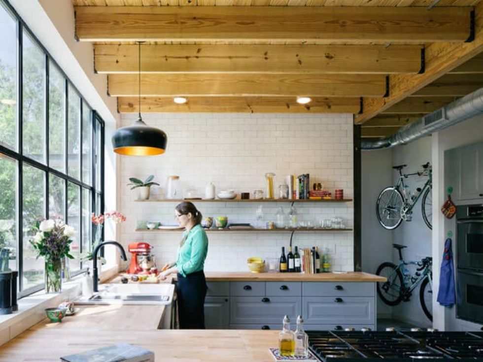
Holly loves to cook, so the couple spent a lot of time, money, and effort on the kitchen. She placed the sink beneath an extra-large window, and the cooktop on the peninsula so she could face guests while cooking.
A 2-by-4 frame on the ground raises the counters to nearly 38 inches (36 inches is standard) to make kitchen work easier for Holly, who’s 5-foot-10. “It made a huge difference on the natural movement of chopping and doing dishes,” Shane says. “And she says she feels less back pain in the kitchen.”
They originally planned for only a tile backsplash, but they spent a few hundred dollars more to tile the entire wall. “It made a big difference,” Shane says.
They purchased relatively inexpensive butcher block counters from Ikea and had a woodworker join them together to look like one piece. The father of one of Shane’s best friends made the dining table out of reclaimed longleaf pine. The couple purchased chairs for $20 each during a high school fundraiser.
“The idea of a master suite and larger private spaces are down the line,” Shane says. “There’s no master suite or walk-in closets. The concept was just to get a house that we liked in the neighborhood, then expand over time as our family needs grow.”
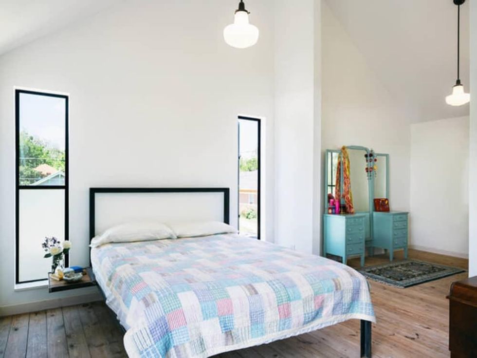
The master bedroom is essentially two bedrooms with a sliver of a wall separating them. “We don’t actually need three bedrooms right now,” he says. “We don’t have children, so we left out a section between the two bedrooms.” Holly uses the connected room for storing her clothes and getting dressed. When the time comes to add on that master suite, they’ll fill in this wall and create two kids’ rooms. “I wanted to give us the flexibility of more bedrooms but let us live in a larger space temporarily,” he says.
Two-by-6 tongue and groove pine lumber makes up the floor. There is no plywood subfloor or sound foam. Instead, the bottom of these boards form the ceiling in the kitchen below. “I wanted to see those individual solid wood boards as opposed to the plywood below,” he says. “If someone has hard shoes on, you definitely hear it, but it’s not as bad as I thought it would be. There’s only two of us and a dog.”
Shane also fabricated the steel bed and clip-on hanging bedside tables. The mirror and dresser came from Holly’s mother. One rug is from Ikea; the couple bought another in Morocco.
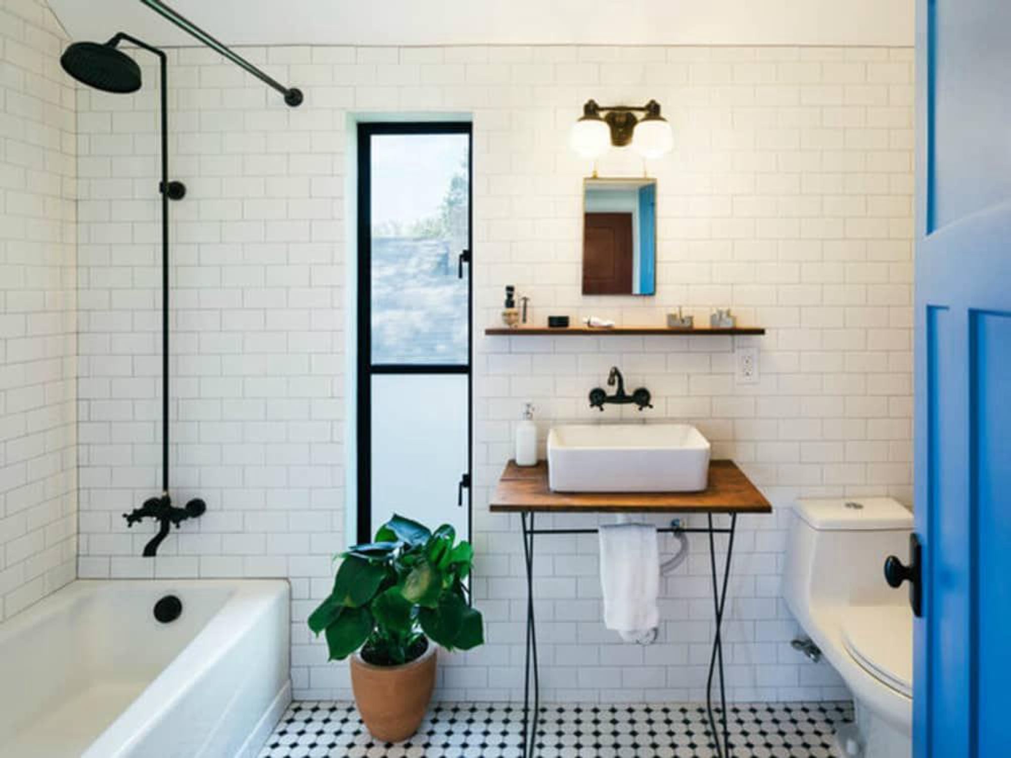
They used the same tile from the kitchen in the main bathroom. It has a matte finish with a light gray grout. Shane estimates he paid $1.10 per square foot for the wall tile and $3 per square foot for the basic octagonal and dot floor tile. The shower and sink fixtures are from eBay. “Everything we chose was fairly inexpensive,” he says.
Holly picked out various prefinished, prehung doors from Lowe’s in four vibrant colors for most of the upstairs.
From the outside, you can see the rear expanse of windows and the modern farmhouse shape of the home. “I’ve always been interested in the vernacular architecture that you see around Texas — anything that has to do with a barn or shed or horse stable,” Shane says. “I really like the straightforwardness of those, the utility. That’s where this shape comes from.”
